These 5 website tips are an ideal starting point for those looking to reinvigorate their web presence in the new year.
Embrace a Dynamic Colour Scheme
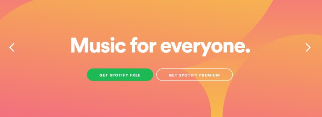
We spoke about the role of colour in branding last week – while minimalism and colour blocking is the trend with logos, website design in 2018 appears to be all about a whirlwind of shades. Spotify’s Australian website is a good example of the vibrance, saturation and eye-popping colours we can expect to see more of in 2018.
Users view websites in 2018 on high definition computers and smartphones, making the colours stand out even more. Businesses looking to find a niche can use patterns and colour gradients to create something visually unique.
Utilise Powerful Typography
It’s not just colours where web designers are looking to stand out – dynamic typography is becoming more common in modern web design. Typography has significant visual power, both in terms of evoking emotion and establishing the personality of your brand.
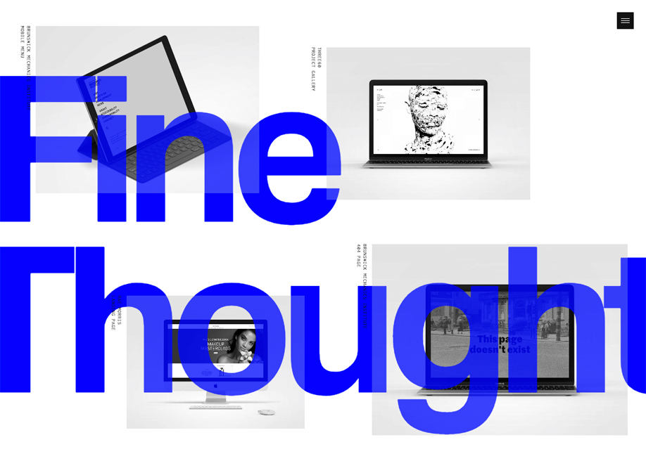
Australian-based web developer Nathan Leigh Davis uses powerful typography on his website, shown above. This is a good example of the bold text and contrasting colour we can expect to see more of this year. A strong typeface choice has to serve a specific purpose, but it can truly distinguish your brand from the competition if you pull it off.
Make Micro Interactions
Not all of these website tips relate to pure aesthetics. The days of brash animations and flashing lights have thankfully passed when it comes to web design, but developers can still use simple animations to enhance user experience.
Users have responded well recently to content and features that create a more personalised experience. Simple animations that appear when you interact with certain sections of a website have become popular recently, and we expect this to continue. Businesses can even utilise interactions such as polls and simple games to drive engagement and brand recognition.
Micro interactions don’t have to be immediately eye-catching or perceptible. Something as simple as a hover effect or loading icon can be easily integrated using WordPress to improve the function or appearance of your site.
Concentrate on Customer Experience
While this is a given, web designers and businesses have never placed a greater emphasis on strategic thinking than they do right now. Businesses are going to great lengths to learn exactly what their target audience wants from their online experience.
User interviews, detailed research, polls and other techniques are used to create a consistent tone and message that is employed in all interactions with customers. Web content, email marketing messages and social media posts abide by these established guidelines. Derivative sales messages just don’t cut it in 2018, so really listen to your customers and make some changes.
There are a number of tools and applications available to help you understand how users interact with your website. One such example is Crazy Egg, an optimisation tool that chronicles the journey that users take when visiting your site. Users of this tool can receive detailed reports on a number of metrics such as time spent on site, heatmaps, country the site is visited from and much more.
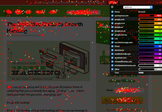
The above screen from Crazy Egg demonstrates where users click on a given site, broken down by how they were referred to the site in question. These detailed analytics can be a useful tool in understanding and taking advantage of user preferences.
Make Mobile a Major Focus

Mobile is no longer an afterthought when it comes to website and E-commerce platforms. Users expect and demand a seamless experience that loads quickly and functions equally as well or better than the desktop equivalent.
The arrival of the mobile-first index has served to remind web developers that mobile is the platform of choice for most online browsing and purchasing. Fortunately, new technology makes it easier for developers to develop mobile platforms that can be adjusted on the fly to fix UX issues as they present.
Google offers a free Mobile Testing Tool that measures the loading speed and user experience of your mobile platform. Simply visit the link and enter your homepage URL to see if your site is up to speed or requires improvement.
Modern Design and Website Tips from Studio Culture
Our team of experienced developers can help your business by updating your existing website, or starting from scratch with a modern, user-friendly platform. We design websites that are optimised for mobile and customised to suit your business.
For website tips or to discuss our range of services, give us a call today on 1300 200 113 or email hello@studio-culture.com.au.