You can nuance the experience of visiting a website without forceful and clumsy attempts at manipulation. With strategic use of colour, you can influence how others perceive and interact with your website.
To do this, we’re going to take a little crash-course the art of colour theory. It’s a fascinating and deep subject, which has been at the core of every great painter’s work, or at the forefront of every successful business’ branding. Here’s a few basics to get you started.
COLOURS YOU CAN USE IN YOUR WEB DESIGN
Once you have a design, you need to colour it. Your choices are key here as different colours bring forth a different set of values and emotions with them.
RED
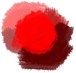
- A powerful colour, the different shades invoke different, similarly powerful feelings, those of power, passion, tastiness, courage, movement, joy and even eroticisim.
- They can also can bring across more negative emotions as well, as do all colours. Sensations include rage, anger, blood, danger and fire.
ORANGE
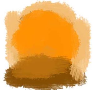
- A cheerful, high-visibility colour that gives the impression of creativity, fun, youthfulness and energy.
- Orange has few negative connotations, the main one being that it’s a warning colour. It does need be used carefully; however, to avoid blinding your viewer with excesses of bright colour.
PINK

- The colour of femininity, romance, love, beauty, tenderness and softness.
- In the Western world, it also brings along ideas of immaturity and weakness.
BLUE
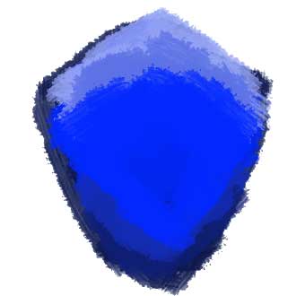
- Another strong colour linked with security, strength, science, friendliness, trust, loyalty, calmness and authority.
- Blue also can have negative connotations, and is commonly associated with depression and sadness, or conservatism and frigidity.
GREEN
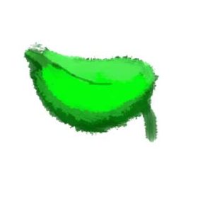
- Colour of the natural world. It can invoke feelings of freshness, healing, growth and nature. It also creates moods of safety, and soothing, with hints of money and wealth.
- Certain shades of green can also be seen as the colour of jealousy or sickliness and illness, especially pale greens tinged with yellow.
YELLOW
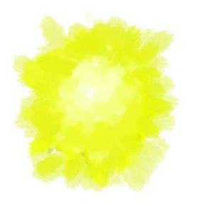
- This is the colour of energy, excitement, joyfulness and newness represented in the real world by the yellow of a day’s rising sun.
- It is also linked to ideas of warnings of danger and cowardice.
WHITE

- Represents purity, cleanliness, softness, goodness, high tech goods, simplicity and medicinal products.
- Nothing but white can be also be regarded as stark and lifeless, sterile.
BLACK

- The colour of cool, sophistication, elegance, formality, classic timelessness, secrets and mystery.
- It is also the colour of death, danger, the unknown and darkness.
GREY
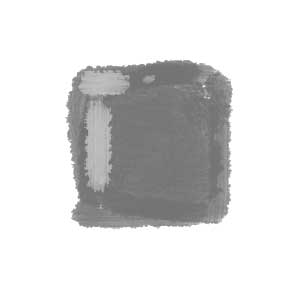
- Seriousness, modesty, practicality and durability.
- Sadness, oppression, gloominess and boringness. Unemotional and detached. Be careful with grey, as it’s somewhat the opposite of orange, its positive attributes overtaken more often than not by its negatives.
Of course, if you’re targeting a multinational audience, you need to factor in the differences of cultures. Just as hand gestures and table manners differ in their meaning around the world, so do colours.
While Europe, the US and Australia are all fairly similar, here are a few examples from other regions of the world:
- Red in China is the colour of joy and happiness, while in Japan it is the colour of life and mourning in South Africa.
- Pink in Korea is trust.
- Most of Asia considers yellow the colour of royalty while Egypt uses it as a colour of mourning.
- Asian countries famously see white as the colour of death.
For a more indepth discussion about websites aimed for those abroad check out our earlier blog post on just that!
Combining Colours
Great! Now you have a good understanding of what basic colours mean and an idea of what you could use depending on the mood you’re trying to evoke from your website.
But we’re not done yet.
You can’t take all the colours that represent your values and throw them together on a website and expect them just to work; just as you can’t bake a cake by taking all the things that you like the taste of and throwing them together in a mixing bowl. That’d make things too easy. Certain colours work well with each-other, and don’t at all with others. So how do you figure out what you can use?
Colour wheels.
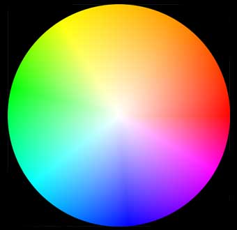 Perhaps you made some in primary school or poured over them when picking out paints for your home. They are essentially a circle with all the colours of the visible spectrum represented on them, and are powerful tools to help you find what colours work well together by following some simple rules. There’s a several out there, with varying levels of complexity, so we’ll just have a look at a few of them for now.
MONOCHROMATIC
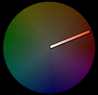
Like it says on the tin, this rule uses just one colour. One colour isn’t enough to make a website, which is why monochromatic colours also include all the shades of a particular colour.
With your colour wheel, pick a colour you like, and then draw a line from that point to the centre of the wheel. The shades along that line are in the monochromatic scale, and with a little space between each, will work nicely with each other.
COMPLEMENTARY
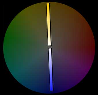
Now we’re starting to get a little more complex. Take a point on the colour wheel and then put your finger on the colour on the opposite side of the wheel to it. These are complementary colours and are excellent at showing strong contrast. An example of these sorts of colours would be dark blue and yellow. Just as with the monochromatic scale, you can also play with the different shades of complementary colours which aren’t perfectly on the antipodes of the wheel. For example, a deep dark blue will still work with a light, pale yellow- not just a bright, sunny shade.
TRIADIC
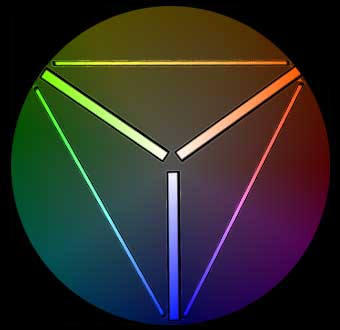
Triadic colour schemes work similarly to complementary colours. Imagine an equilateral triangle, with each vertex resting on a colour somewhere around the colour wheel. As one point moves, the others do to to stay proportional to each other, resting on the other colours that work strongly together.
This is just a small offering of what the colour wheel can do for you and how colours can’t be simply thrown together thoughtlessly. To have a look at further rules and to play around with an intuitive colour picking tool, have a look at Adobe Color CC. Experiment with the colours of your own brand and see what works and why.
Colours clearly have an important place in your planning, and make a great difference to your website and brand image. Check out our web design portfolio to see how we’ve used colour to hilight the character of different brands.