
Thanks to the Internet, our world is now smaller and more connected than ever. The cultural floodgates have burst open, and countries are now exposed to (and adopting) cultures from opposite sides of the world. Naturally, this has affected how websites around the world look and function.
Do websites from different parts of the world still have their unique style and aesthetics? Or are most of them starting to look more similar now?
We’ve taken a quick look around for you and analysed websites from four different parts of the world (five websites per region). Here’s what we found.
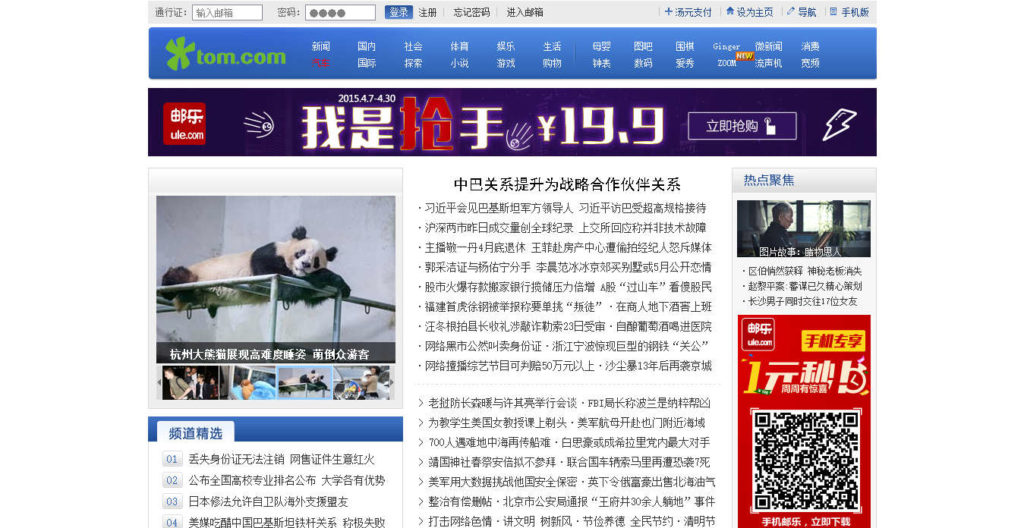
Website design examples: China
In the past, the typical Chinese website would sometimes be described by designers as messy or cluttered. It was common to see web pages filled with text and images or lacking a clear organisation of information. A look at some popular Chinese websites today, however, shows that perhaps they’re starting to adopt a cleaner, more orderly design aesthetic. And although some do still look cluttered and disorganised, others appear to have embraced the clean and organised aesthetic of most Western-made websites.


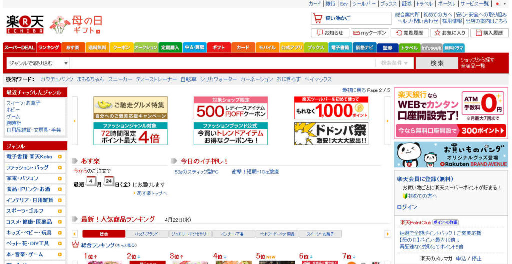
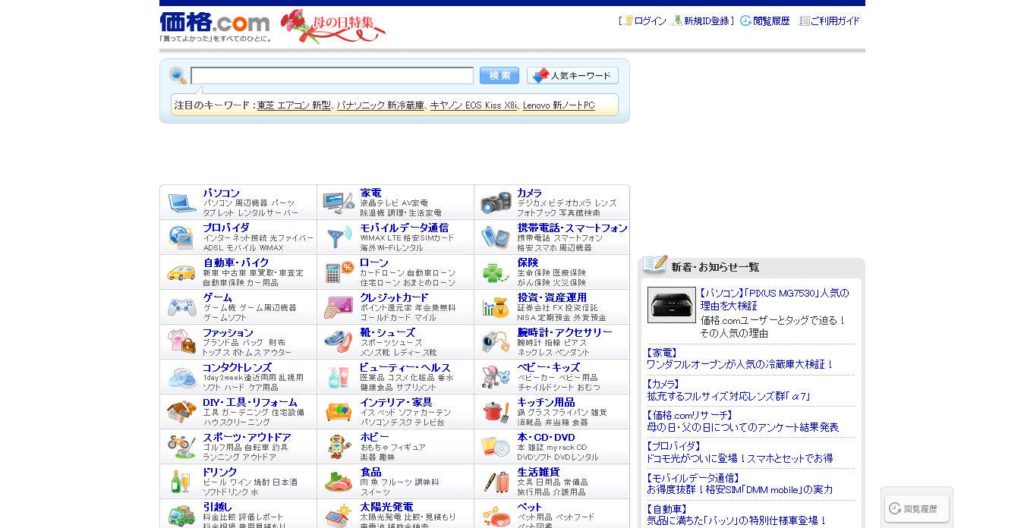
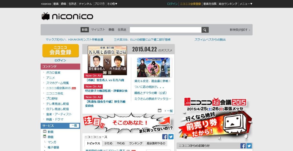
Website design examples: Japan
Like China, the typical Japanese website of the past could often be described as cluttered, with heaps of information and text filling up most pages. This is ironic, considering Japan was very influential in the rise of minimalism in the art world. But as these following screenshots show, it appears that they’re also now also adopting a cleaner, more organised structure and design. (With some exceptions, of course.)

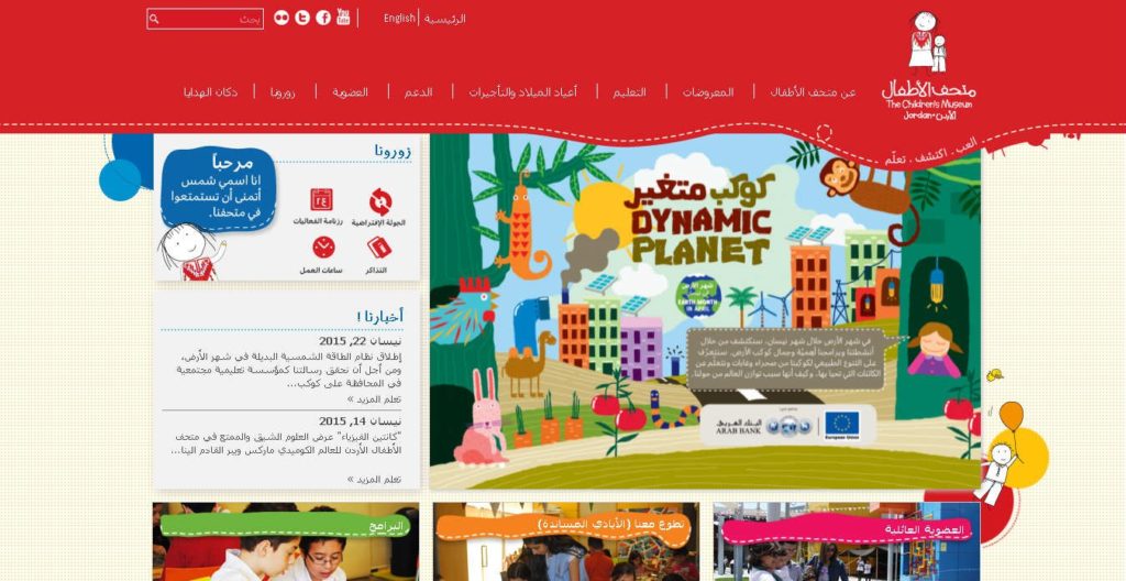
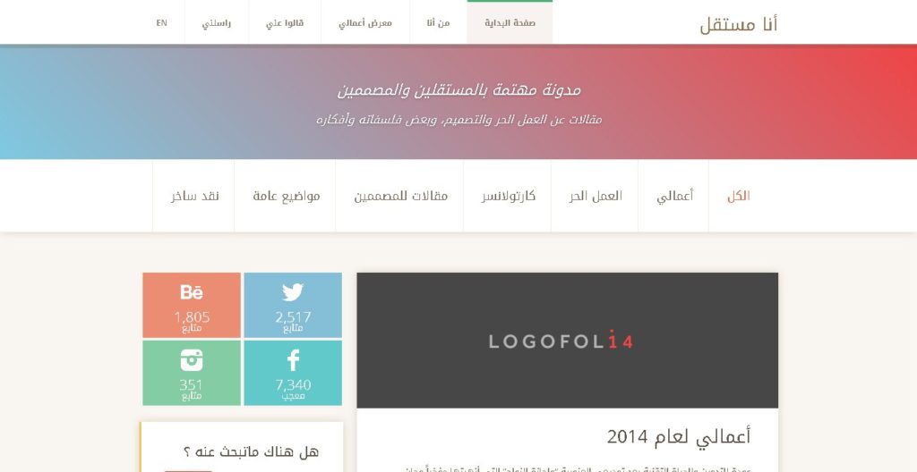
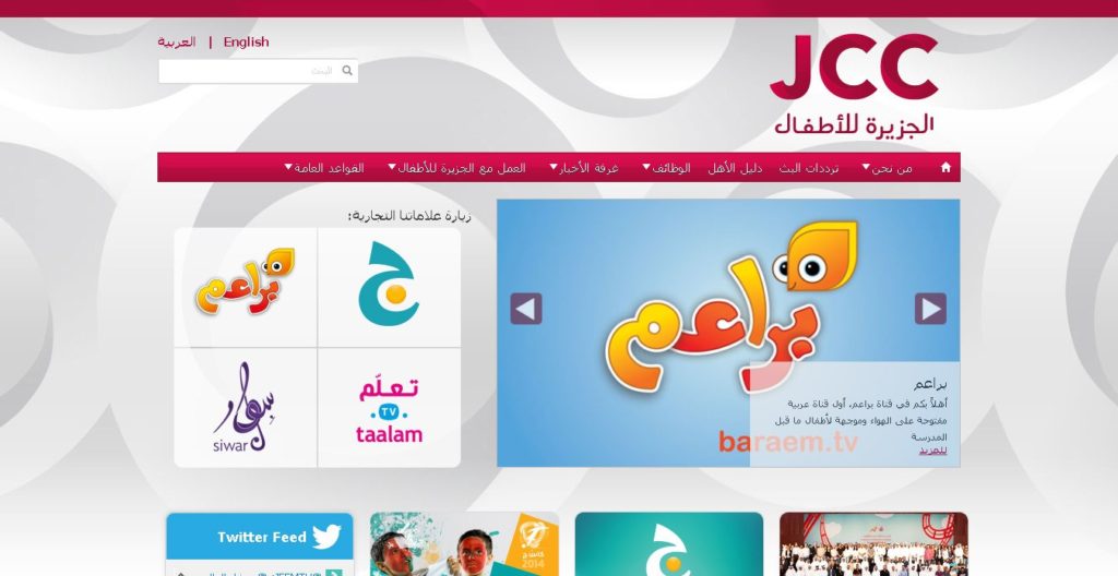
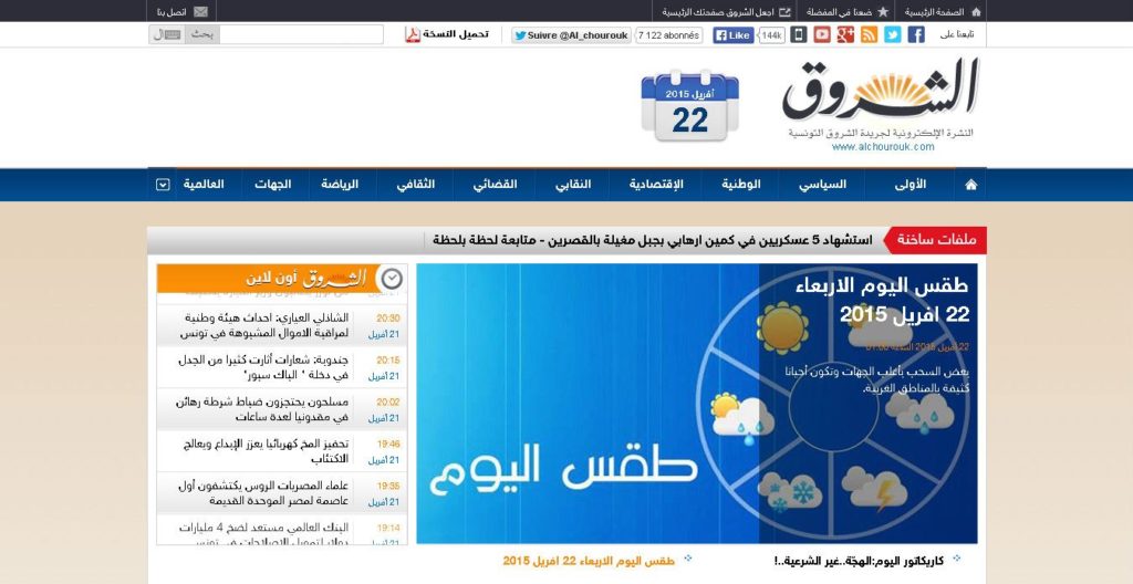
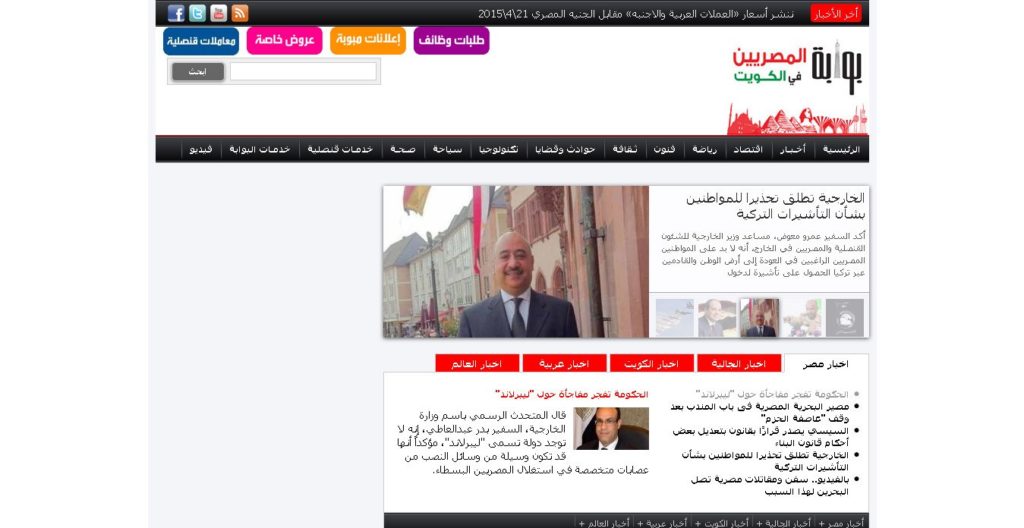
Website design examples: Arabic
Unlike the ornate and vivid nature of most Arabic art, the typical website from the Arab region seems to be more conservative and straightforward. Some websites, however, seem to have a more modern approach than others.
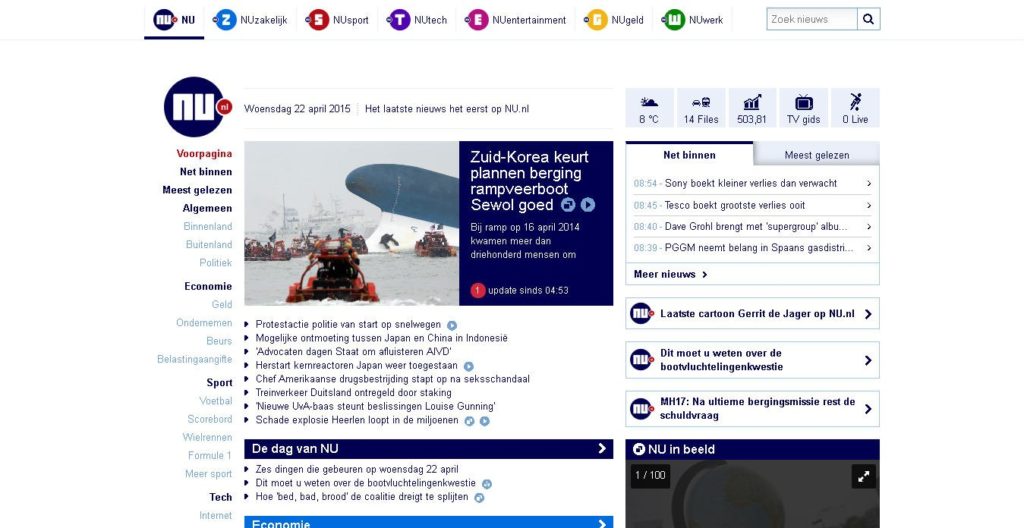
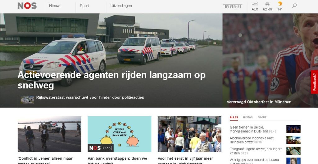
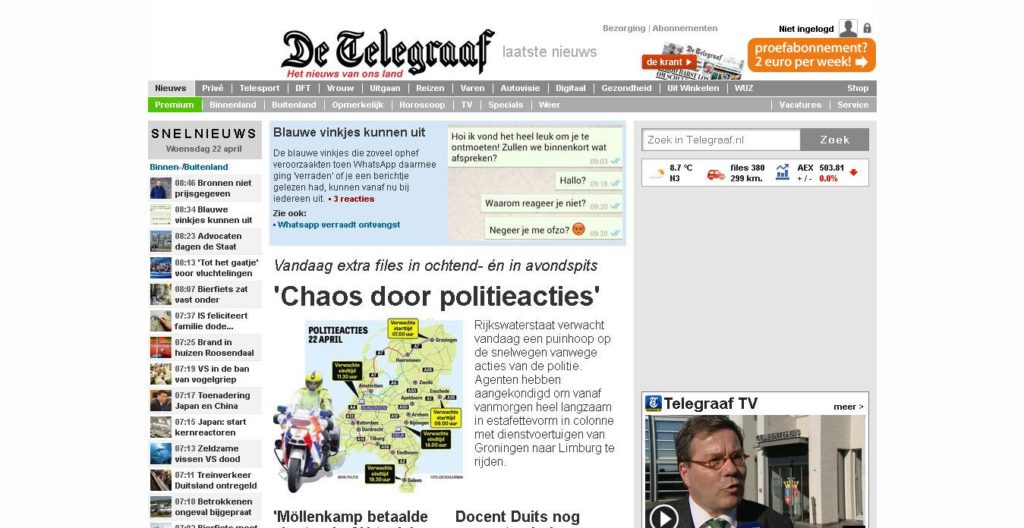
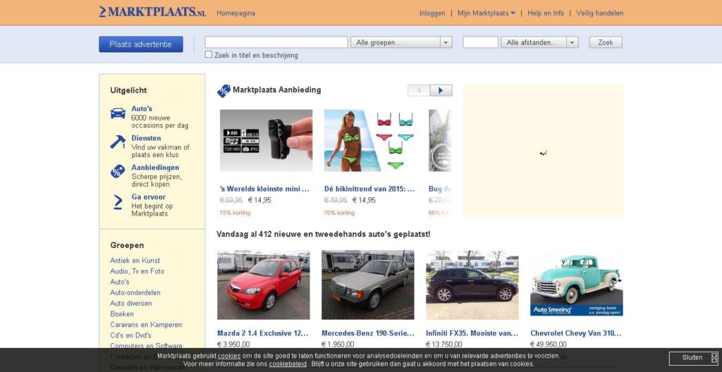
Website design examples: Netherlands
Netherlands has a long history of having a strong visual aesthetic. This is no surprise for a country that was the birthplace of artists such as Van Gogh, Rembrandt, and Mondrian. A look at some popular websites in Netherlands, however, shows that the typical Dutch website isn’t as different as you would think it would be. With that said, there are many Dutch websites that are more modern and very different from the norm (see last screenshot).
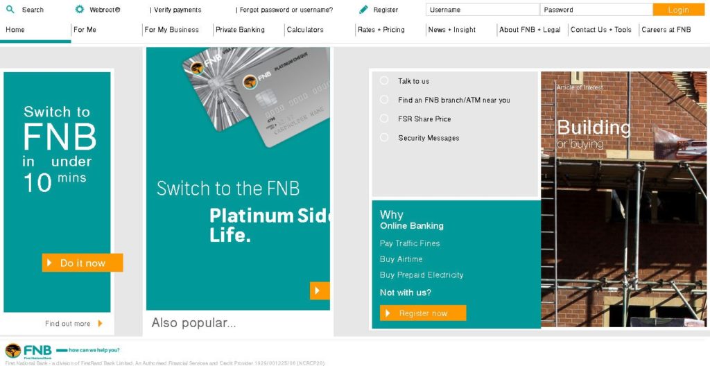
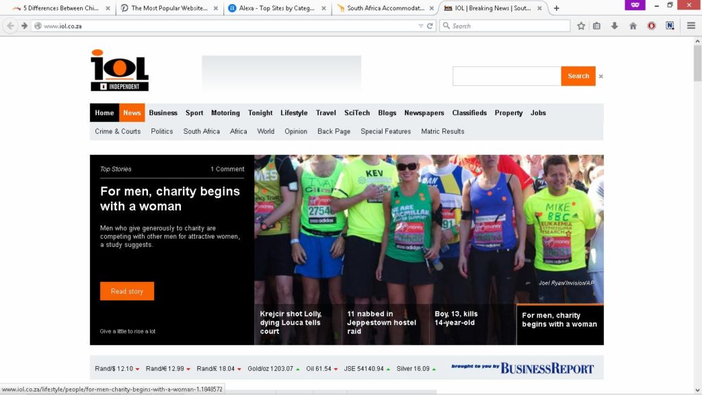
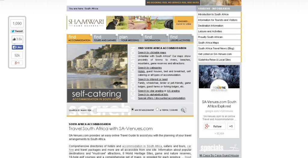
Website design examples: South Africa
A look into some of the most popular sites in Africa show that they’re very similar to most other Western websites, usually having a clear and organised layout with clean lines and divisions.


So what do you take from all these? Simple. It appears that most typical websites around the world are starting to look more and more similar. Even countries that don’t use the Latin-based alphabet that we use (i.e. Chinese, Japanese, Arab) still have websites that look and function like those from other countries.
Of course, there are many exceptions to this and this generality doesn’t apply to all. There are several websites around the world that go against the norm, and they look, function, and feel different from what you’ve seen here. But these examples show that perhaps there’s a standard look and functionality growing in the world of website design.
Do you agree with these website design findings? Or know any great examples that go against this norm? Feel free to comment and share them. We absolutely love website design, so we’d love to know what you think.