At Studio Culture, we know trends—maybe not in fashion, but in design. Clients often show us websites that they love during the first stages of their website development at our Brisbane office. We’ve picked out some of the most common trends that we see amongst popular websites. These trends aren’t bad, but as with fashion, if you want to get noticed, it’s not the best idea to always follow the leader.
Website design trends: widescreen wonder
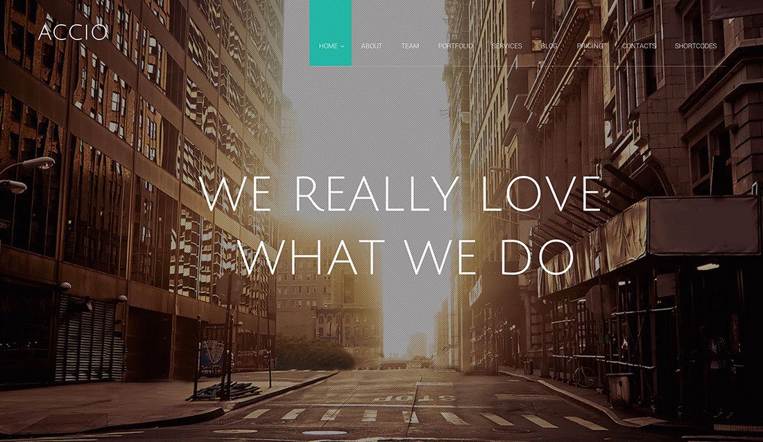
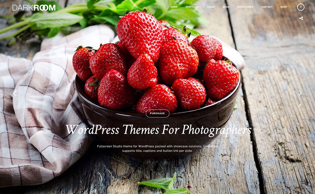
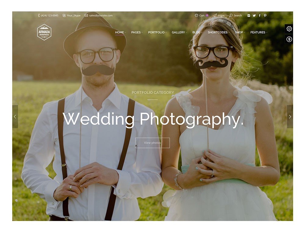
(These examples are all from colorlib.com, a website for generic WordPress themes)
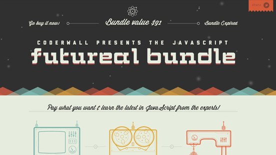
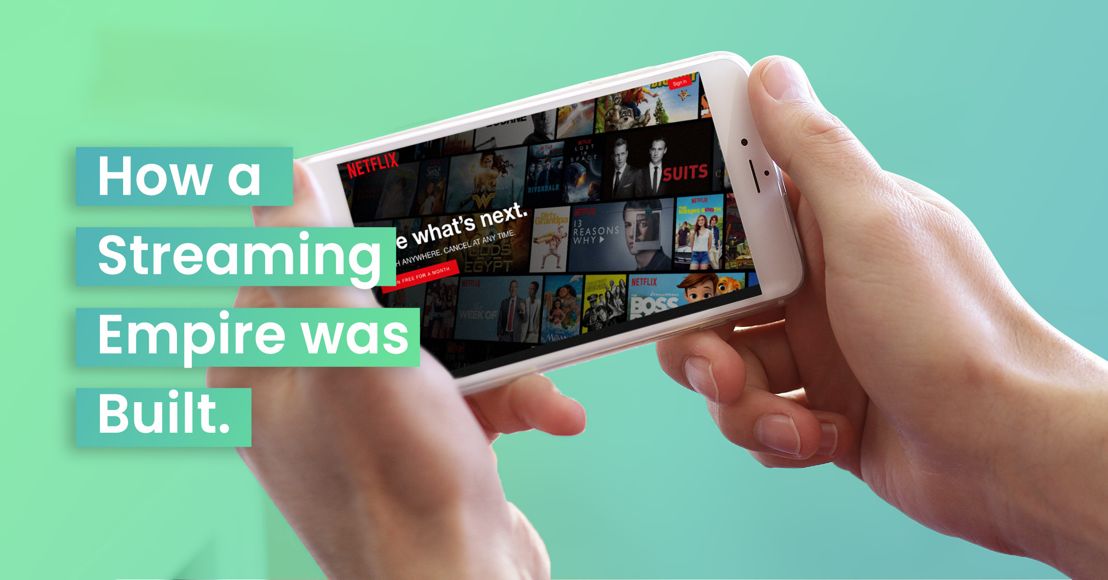
Full-screen means full effect, no? In isolation, it certainly does. If you saw one of these sites using the flashy genius of edge-to-edge photographic backgrounds, and then never saw another, you probably wouldn’t forget that website. We’ve talked about the importance of being visual before. We absorb images far more easily than words, and full-screen photography can look incredible on a home page. It can snag your visitor in those crucial first seconds, and tell them enough about your project to pique their interest. However, running with this now can make your website look samey, especially if you’re a photographer, or if your images aren’t unique to what you’re selling. You can’t vary a full-screen photograph all that much. Note also that this style is often used in free website builders; all the examples we found were template themes. Templates can be very hard to customise, and because they’re available to anyone, they make your site even less distinctive.
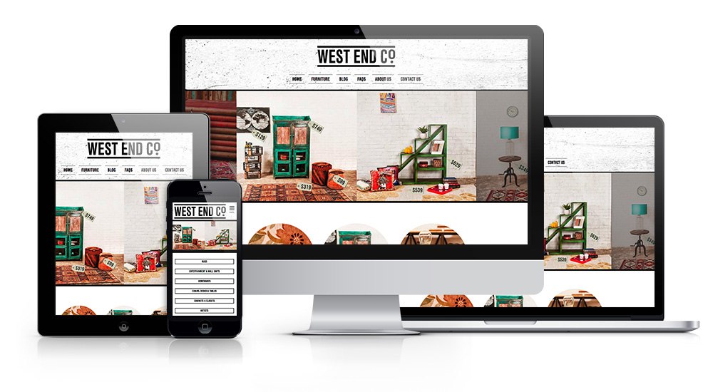
(This is an example from our own portfolio)
Instead, think about large content blocks. You can still take advantage of those big, grabby images, but by butting them against one another on a page, you can guide the reader through more content, one block at a time. Content blocks, especially those that include images, bold fonts, and make good use of space and colour, leverage our brains’ preference for chunks of discrete information, and help make you more memorable than the next full-screen, real estate hog.
Website design trends: flatten everything
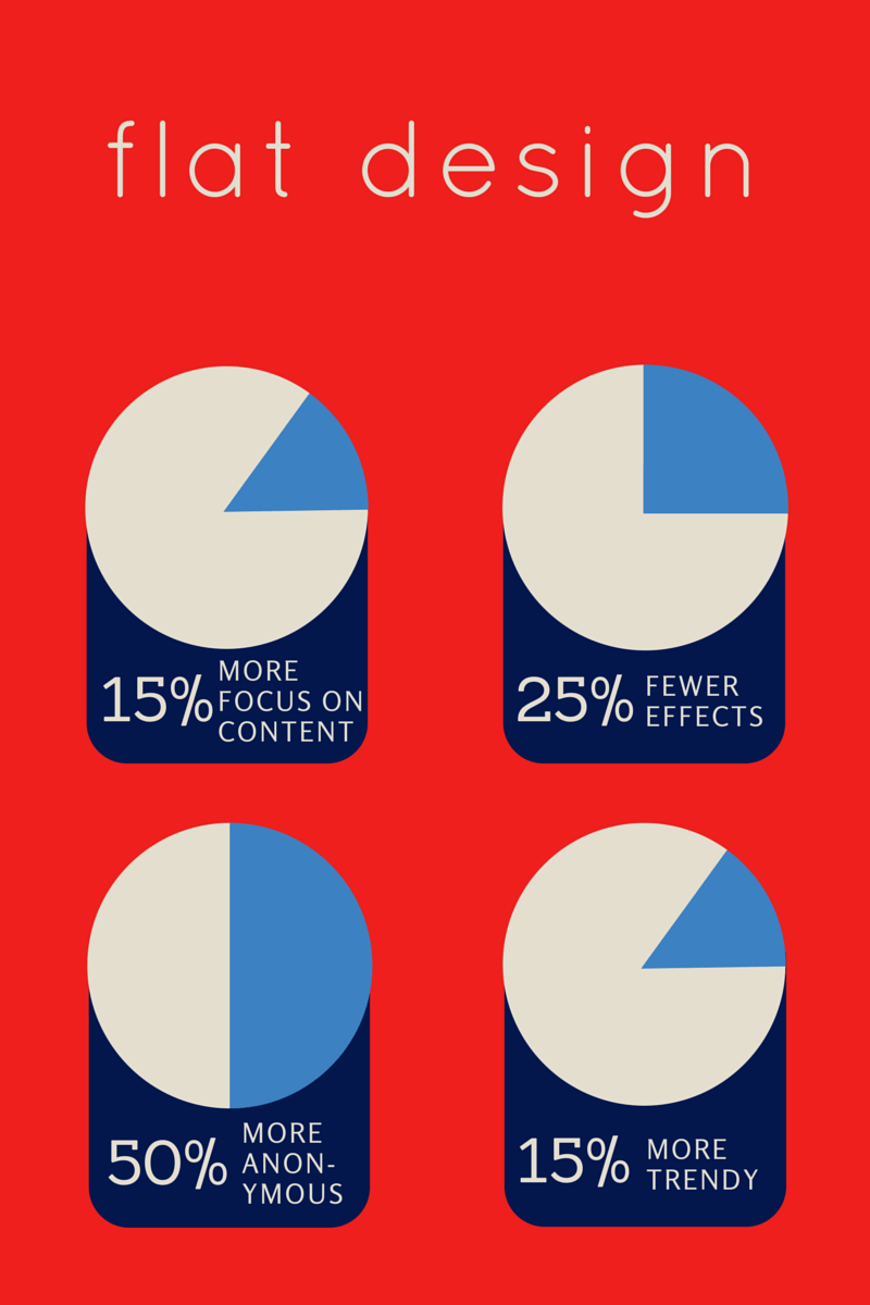
We ‘blame’ Apple for this one, with their latest razor-crisp iOS interfaces. Flat designs focus on usability and content, which is fantastic. Nobody wants a second wave of those monstrosities from the 2000s. It’s also a godsend on a mobile device, which is everyone’s preferred way of browsing the web today.
The lack of distractions, often coupled with bright colours, clean fonts, and yes, full-screen photography, can be devastatingly simple, streamlined and functional if it’s executed well. However, it can also lead to frustrating over-simplification and vagueness. You want an elegant design that balances minimalism, practicality and is visually exciting, not a boring or bare one.
(This example is from thedesigninspiration.com – A great example of flat design that’s still visually exciting.)

(This example is from behance.net – Notice how it is so flat and abbreviated that the buttons don’t actually tell you anything.)
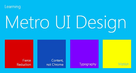
Website design trends: so metro
(This example is from cssjunction.com)
Ever used Windows 8? You’ll know this aesthetic instantly. Put your text (preferably a sans serif typeface with a thin stroke width—like Helvetica Neue Light) un-centred within a block of solid colour (preferably light or pastel). Voila! This specific typeface and colour combination was originally used to project the cleanliness and smoothness that the likes of Microsoft and Apple want us to associate with modern software and technology. It’s become a little divorced from this representation, and it now unfortunately has the tendency to sterilise products that it is being used to represent.
There are millions of fonts and colour combinations out there; be playful. Don’t forego the humble serif font because Times New Roman is stuffy and old-fashioned. These fonts can be lively and full of character (which is much easier to get associated with your product or business than an anonymous, thinly-lined serif). Experiment with limitless other colours—don’t just find your favourite light pastel blue from another site and eyedropper tool it. That colour is already associated with something that isn’t you.
What other massive trends have you seen online? Let us know, and we’ll avoid your least favourites!