 Four big websites that we all use on a daily basis – Google, Facebook, Alibaba, and ebay – have one important thing in common. Fantastic website design. Myself and the expert web design team in Brisbane have picked apart each site and come up with five key things to learn from the big four.
1. White Space
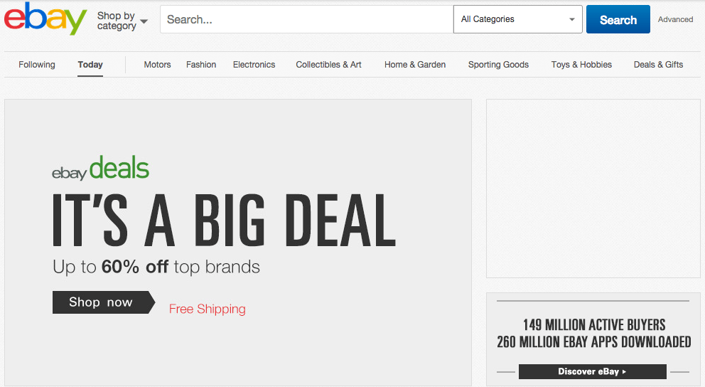
All four of these sites do this well, but ebay in particular pays exceptional attention to its white space. The top of the homepage – where the eyes first go – has the logo, a search bar, category button, search button, and two rolling ad banners. That’s it. The audience’s eyes are immediately drawn to the large advertisements that are displaying sales information, which is going to hook customers in and make them want to know more. Webpage clutter is never a good thing, so have a browse of ebay’s homepage to see how a large amount of information is spread out successfully.
2. Consistent Branding
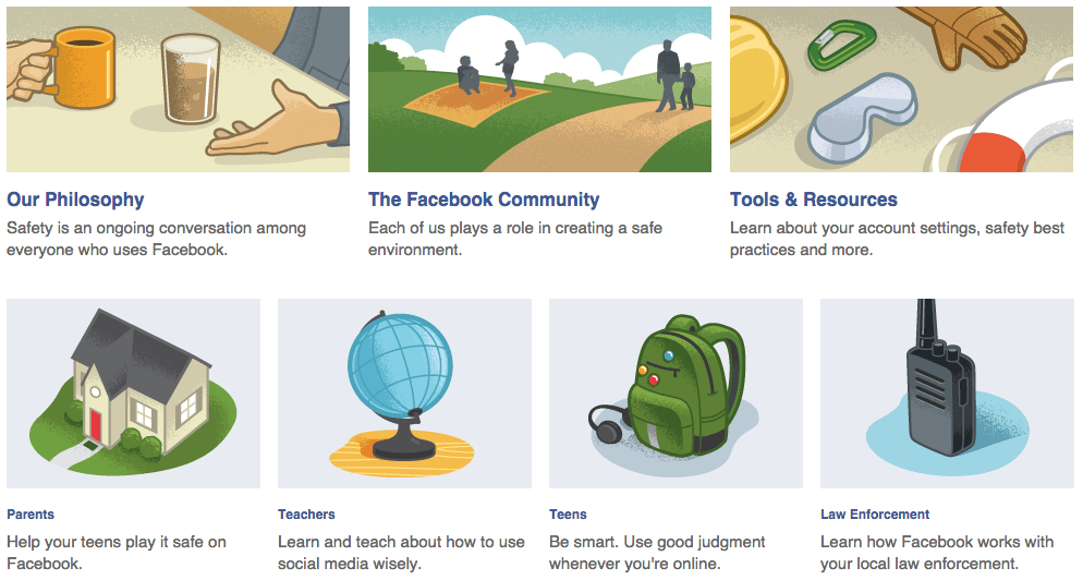
We’ve written a few web branding posts before: visual branding and social media branding. We are big fans here at Studio Culture! To keep it short and sweet: make sure that no matter what page your customers visit (including social media), they’ll know it belongs to you. Facebook has done this throughout their customer service pages by using similar illustrations to depict each help topic. You can do this for your own business using visuals, logos, colours, page formatting, and more. Be creative, but always keep your brand in mind.
3. Logos and Colours
As soon as you see blue, red, green, and yellow text what do you think of? And white text in a blue box? Google and Facebook both do logos and colours extremely well. Having a strong logo with a unique colour will help customers notice you on the web, which will evolve into recognition and brand loyalty. For businesses, that means sales! A great logo is the first step to strong online presence so definitely don’t underestimate it.
4. Clear Headings/Topics
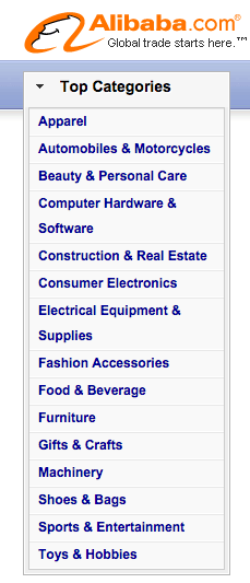
Similar to the white space rule, you don’t ever want confusing headings or a hard to navigate main menu. It will fill the page with clutter, confuse your audience, and lose you a lot of traffic! ebay and Alibaba focus on product sales and therefore split their inventory by product type. Depending on your business, this is completely customisable – just think about what your customers will want to see and how they would want to navigate the site. Keep it clear and consistent and keep and eye on where people seem to be clicking the most so you can alter headings if need be! We wrote a whole article on conversion rate optimisation here if you want more information on how to do this.
5. Buttons and Social Media
Alibaba has social networking sites in clear view on their homepage. I’ve noticed a lot of websites stick their social media buttons out of sight, usually at the bottom of pages or not even on the homepage at all. Try moving buttons around and testing where they are most clicked on. Remember social media followings will boost word of mouth for free so it’s definitely worth the time to investigate.
For any web design (including the all-important logos!) or social media help, contact us today at Studio Culture.
