Designing your logos and selecting business colours can be an exciting aspect of starting a new enterprise, but there is a lot to consider.
As consumers, our minds makes decisions almost instantaneously – you’ve got a couple of seconds to convey the purpose of your brand and make a positive impact. These tips for choosing business colours will allow you to create branding that your target audience reacts positively to.
Less Is Sometimes More
There has been a trend toward minimalist design principles in recent years, and for good reason. Clear, uncomplicated design that communicates a brand’s purpose can be very aesthetically pleasing. Brands often opt to use only two colours, or a single colour against a solid background in their branding.
Branding that uses an explosion of colour can be seen as dynamic and playful, but may not fit with the industry you work in. Law firms and banks often use austere, muted colours to convey the professionalism of the industry – super colourful branding in industries such as these would likely be poorly received.
Consider the Psychology of Colour Schemes
Do colours naturally elicit specific emotions, or have we been conditioned to think a certain way through association? We’ve spoken on the subject before with regard to web design.
Colour theorists believe that certain colours trigger a physiological response. This business colour wheel from Edmundson Design sums up the emotions often associated with certain shades.
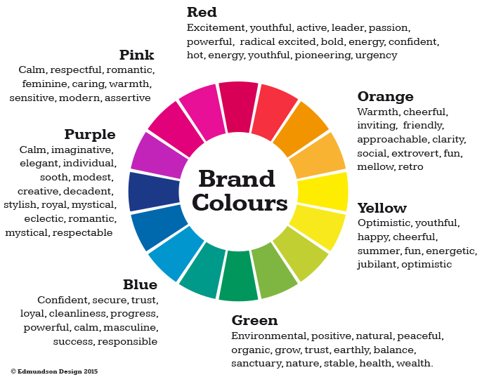
It is often stated that 80 per cent of the visual information gleaned when looking at a logo relates to the colours used. As business owners, you can choose to follow these commonly held beliefs when branding or follow your own instincts. Certain industries follow certain colour schemes for a reason – find a way to observe these principles while distinguishing yourself from the crowd of other businesses.
Think About Your Competition
Successful businesses offer a point of difference from their competition. As we associate certain colours so strongly with certain businesses, it is good practice to ensure your font style and business colour schemes are not too similar to those of your competitors. Coca Cola and Pepsi are linked with red and light blue respectively – strong colour association allows you to carve out a niche in your target market.
If you are looking to rebrand after a long period of operation, it is advisable to keep the same or similar colour scheme. An exception to this would be if you were radically changing your service or product line.
In the End, You Should Follow Your Heart
When it’s all said and done, if you feel very strongly about a certain colour scheme you should back yourself and go for it.
Think about the message you’re trying to send, the brand culture you’re looking to promote and the industry you reside in – if the business colour scheme you want fits these three aspects, you should go ahead and make it happen. A bold statement of intent in your branding can set your business up for early success.
Branding Services from Studio Culture
Our experienced team offers complete branding services for new and established businesses of all sizes. We can work closely with you to determine the best business colours and styles for your enterprise.
We provide branding services such as corporate design and integration, marketing strategy and competitor analysis. To work with Studio Culture for branding strategy, you can get in touch with our team on 1300 200 113 or at hello@studio-culture.com.au.